Section 4. Scope 1 and 2 trend analysis
Fleet emissions trend analysis
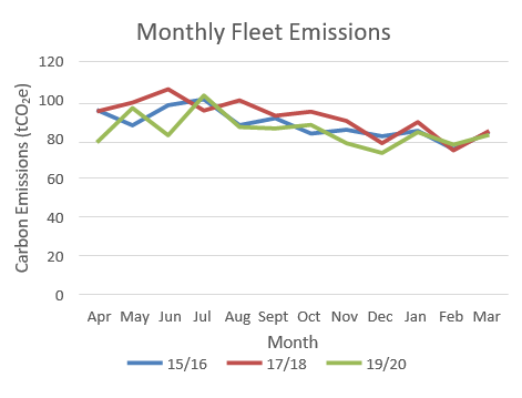
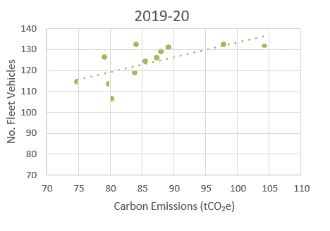
The below graphs demonstrate that ADC fleet emissions fluctuate seasonally, with higher emissions during Spring and Summer months, compared to Autumn and Winter months. This can be explained by looking at the total number of fleet vehicles in operation during each month, which increase during Spring/Summer and decrease during Autumn/Winter. This is demonstrated by the highly correlated emissions data with the number of fleet vehicle in 2019/20. This is caused by an increase in fleet vehicles, such as agricultural and ride-on mowers, during the warmer Spring and Summer months, which are not used/used less during Autumn and Winter.
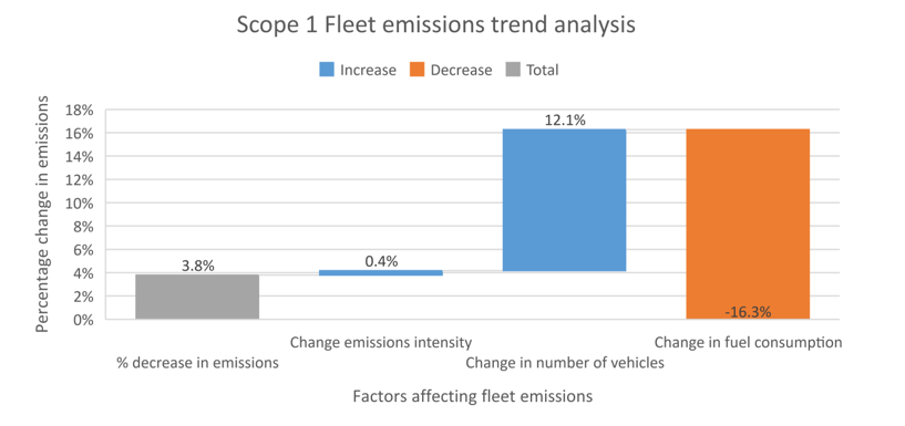
Since 2015/16, there has been a 3.8% decrease in emissions from fleet vehicles. This is a result of a 4.2% decrease in overall fuel consumption, balanced with a small (0.4%) increase in fuel emissions intensity. Of the 4.2% decrease in overall consumption, 16.3% is due to a decrease in fuel consumption, whilst there has been a 12.1% increase in the number of vehicles.
Grid decarbonisation
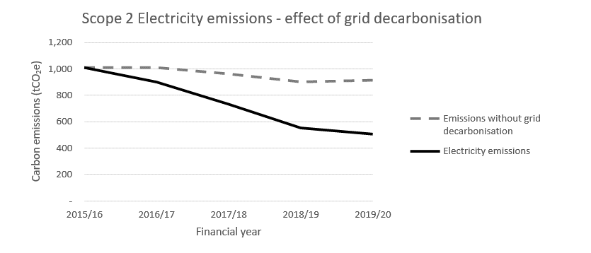
The net carbon emissions presented in this report incorporate annual changes in the carbon intensity of the national electricity grid, as recommended by the GHG Protocol. It is important to note that between 2015 and 2019, the carbon intensity of the UK electricity national grid has decreased by 45%. This is known as greening of the grid.
During this time, Ashfield District Council’s emissions from electricity have decreased by 50%. Of this 50% emissions reduction observed, 81% of this is due to greening of the grid, and the remaining 19% is due to reductions in electricity consumption. This has been assisted by an increase in electricity generation on site during this period.
The national grid carbon intensity factor is expected to continue to decrease as the mix of electricity sources nationally become lower carbon. If ADC maintains the same electricity consumption this would result in lower emissions in future years13. Equally, reductions in electricity consumption in the future would have less of an impact than in previous years on reducing ADC carbon emissions, due to the greening of the electricity grid.
Changing assets
Of the 9.4% decrease in electricity consumption observed (as noted above in Grid Decarbonisation), 30.2% of this is due to changes in the number of assets included in the ADC estate.
Under the operational control boundary, buildings which are under ADC’s operational control are included in the Scope 1 and 2 emissions figures, whilst those which are financially owned by ADC, but for example leased out, are included within ADC’s Scope 3 Downstream Leased Assets category.
As new buildings have also been invested in and come under ADC’s operational control since 2015/16, these have been included in ADC’s figures. Similarly, buildings which have been leased out, or sold, have moved out of ADC’s Scope 1 and 2 emissions.
This shifting asset list has impacted upon ADC’s Scope 1 and 2 emissions, although have only impacted upon electricity consumption, as no sites with gas consumption have been affected by changing assets.
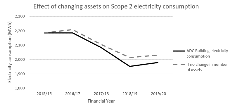
5 sites with electricity consumption have been added (2 in 2016, 1 in 2017, 1 in 2018, 1 in 2019). These have collectively added an average annual consumption of 5.0MWh by 2019/2020 (1.28tCO2e). However, 13 sites with electricity have been lost from Scope 2 (2 during 2015/2016, 4 in 2016/2017, 1 in 2017/2018, and 6 in 2018/2019). Collectively, these had 130.6MWh electricity consumption in 2015/2016. The number of assets at the end of 2019/2020 was 191.14
If there had been no change in number of assets during the reporting period (2015/2016 – 2019/2020), electricity consumption may have been as shown in the graph15.
Weather
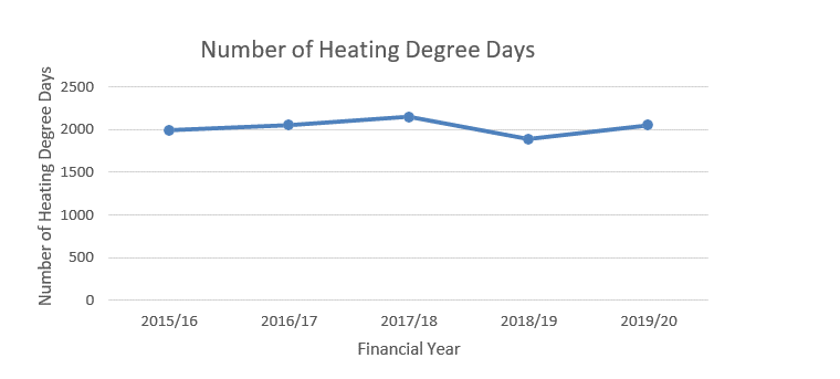
The weather we experience each year varies, which can significantly affect emissions from gas consumption. For instance, a colder winter will result in more fuel being used for heating; whilst a warmer winter will have a lower demand for heating, meaning less fuel is used and fewer emissions as a result. The change in the weather experienced can be measured with Heating Degree Days (HDD). A heating degree day is a measure of how far below and for how many days the outside air is below a certain temperature. The graph shows the number of heating degree days per year for 15.5oC for the East Pennines region, where it is clear 2018/2019 financial year was a warmer year than average.
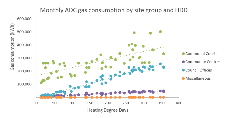
Analysing these heating degree days against the energy consumption for Ashfield District Council site groups of buildings suggests communal courts, community centres, council offices and miscellaneous are all dependent on weather for the quantity of gas used. Overall, these sites’ gas consumption can be considered on average 60% weather-dependent and 40% base load.
Plotting gas consumption against HDD for Leisure, Business Units, and Changing Rooms (not shown) does not show a correlation, suggesting other uses of gas, poor controls or misuse/override which may need further investigation.
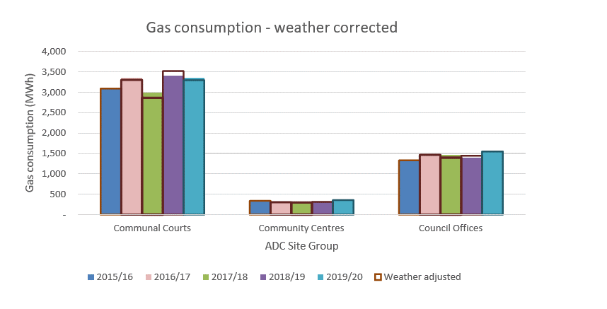
The graph indicates how accounting for the weather impacts the emissions profile for gas for the site groups which have the majority of ADC’s consumption. Solid bars show the recorded gas consumption, whilst the open bars indicate what these would be if corrected for the weather, based on the average weather-dependency for these sites. As in most cases the bar heights are similar, adjusting for weather has little impact on the trends seen in gas consumption, and therefore emissions. Overall, when gas use is adjusted for the weather, gas consumption has still increased by 10% (rather than 12%). As the carbon intensity of gas emissions has stayed constant over the years, this has a similar impact on gas emissions (10% increase when weather-adjusted, 12% increase without weather corrections). This demonstrates that of the 12% increase in gas emissions observed, 16% is due to changes in the weather, with the remaining 84% due to other increases in gas consumption16.
For electricity, however, the vast majority of consumption is not affected by varying amounts of heating due to the weather (average 75% of electricity consumption is baseload).
Renewables
Ashfield District Council have installed numerous solar installations across their estate, as well as three CHP systems, and two biomass boilers17. As a result, Ashfield has been able to use local low carbon electricity and heat instead of using it from the national grid, saving both money and carbon.
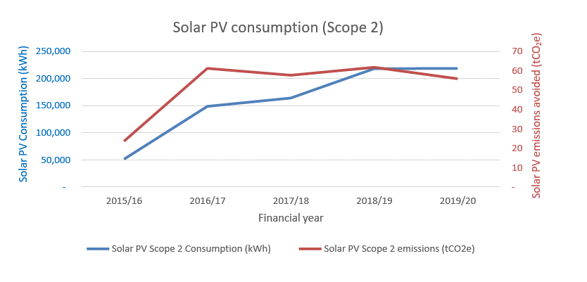
The rate of electricity consumption18 from local solar has risen by 428% since 2015/2016 to 218,411 kWh in 2019/2020. Looking at the trend in CO2e saving per year from these installations, it is clear that the trend initially followed a similar trend to the annual solar PV consumption. Most recently, this carbon saving has started to slow and level off. This is due to the greening of the grid making the emissions difference between local generation and the national grid smaller. Despite this, 55.8 tCO2e was prevented in 2019/20 due to consumption of local solar PV generation. This accounts for 7.7% of the decrease in electricity consumption seen between 2015/2016 and 2019/2020.
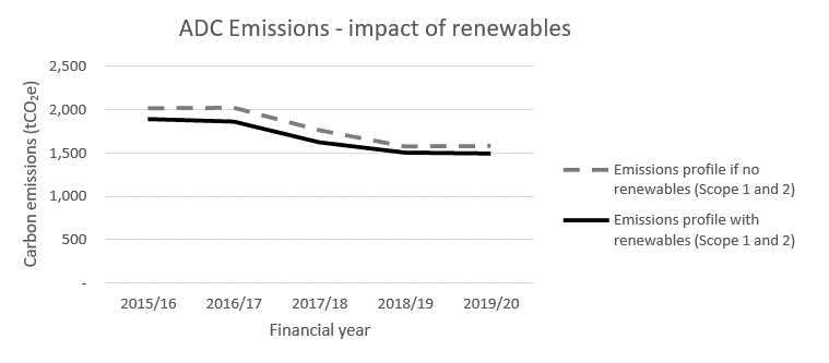
Without these renewable installations (solar, CHP, biomass boilers), emissions from electricity and gas are estimated to have been on average 7% higher than with the installations.
Electricity emissions trend analysis summary
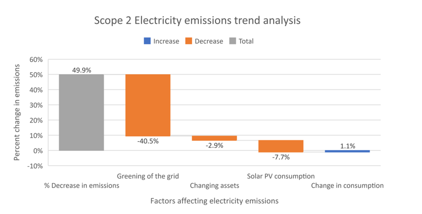
Combining the above trend analysis for electricity indicates of the 49.9% decrease in emissions from electricity consumption observed from 2015/2016 to 2019/2020, 40.5% is due to greening of the grid, 7.7% due to an increase in consumption of solar PV electricity, 2.9% is due to a change in the number of assets. These decreases mask that the remaining changes are due to a 1.1% increase in electricity consumption that has also occurred during this time period.
Gas emissions trend analysis summary
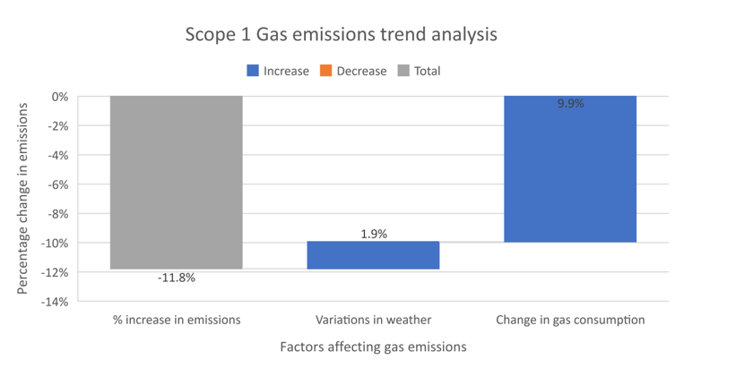
Gas emissions have increased by 11.8% from 2015/16 to 2019/20. 1.9% of this increase is due to the weather experienced, with the remaining 9.9% due to other increases in gas consumption. This may be due to a variety of factors, which would require further investigation. Possible reasons are covered further within the Energy Consumption Analysis Report completed November 2020 by NCC Energy Services.
Business as usual projections
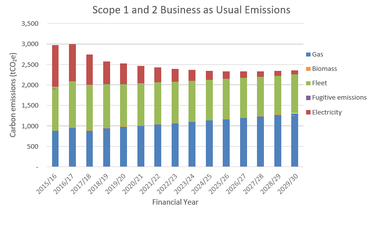
Based on scope 1 and 2 historic emissions trends, future emissions can be extrapolated out to 2030 to demonstrate ADC’s business as usual emissions. The graph below demonstrates ADC scope 1 and 2 emissions would remain at 2,353 tCO2e in 2029/2030, just 21% less than in 2015/2016. Electricity emissions would reduce by the greatest amount (<100 tCO2e remaining in 2029/2030), in line with trends discussed in Section 4. Fleet emissions would also reduce slightly (12% lower than in 2015/2016), meanwhile gas emissions would increase, in line with the historic increase in ADC gas emissions. The resulting impact of this is that emissions would continue to decrease until 2027/2028, after which emissions will begin to increase, due to the annual increase in gas emissions going above the annual reduction in electricity and fleet emissions.
13 Electricity emissions presented in this report are calculated using a location-based approach. The Government's Environmental Reporting Guidelines require that Scope 2 electricity emissions are reported using location-based grid average emissions factors. The location-based emissions reflect the average emission of the grid where the energy consumption occurs and is calculated using UK Electricity grid average factors, used within this report. However, market-based emissions reflect a contractual entitlement to claim an emissions rate, allowing for a reduced emission figure where, for example, a renewable energy tariff is backed by certificates to track attributes associated with energy generation. Ashfield District Council switched to a green tariff for half hourly sites from October 2020, and all other non-domestic non-half hourly sites from April 2021. This reduced market-based figure can be reported in addition to the location-based approach in future years.
14 At some points during each year, the number of assets may have been higher, and electricity use for all sites under the Scope 2 boundary have been included in calculated emissions for the portion of the year they were in scope.
15 This takes total electricity consumption, divided by number of assets in that year, and multiplied by number of assets in 2015/2016. This therefore ignores improvements in efficiency, and focuses on changes as a result of loss and gain of sites.
16 These weather-dependent relationships are explored further for individual high usage sites in the Energy Consumption Analysis reports.
17 CHP systems at Langton Court and Beauvale Court, Micro CHP at Desmond Court, Biomass boilers at Titchfield Court and Sherwood Court
18 Solar PV generation minus PV exported to the grid